Why You Should Avoid Setting line-height to 1 and Using ellipsis Whenever Possible
Setting line-height to 1 is a common technique when text is expected to span only a single line. It is often used to simplify layout and prevent top and bottom spacing from deviating from the desired height, especially when a container has a fixed height—such as in buttons, badges, and tags.
What is line-height on the Web?
The W3C provides a clear definition:
All elements have a ‘line-height’ property that, in principle, gives the total height of a line of text. Space is added above and below the text of the line to arrive at that line height.
For example, if you set the line-height to 1.5 with a font size of 16px, the resulting line-height is 16px * 1.5 = 24px. Subtracting 24px - 16px = 8px, that 8px is split in half and distributed equally above and below the text. This extra space is known as half-leading. Refer to the image below:
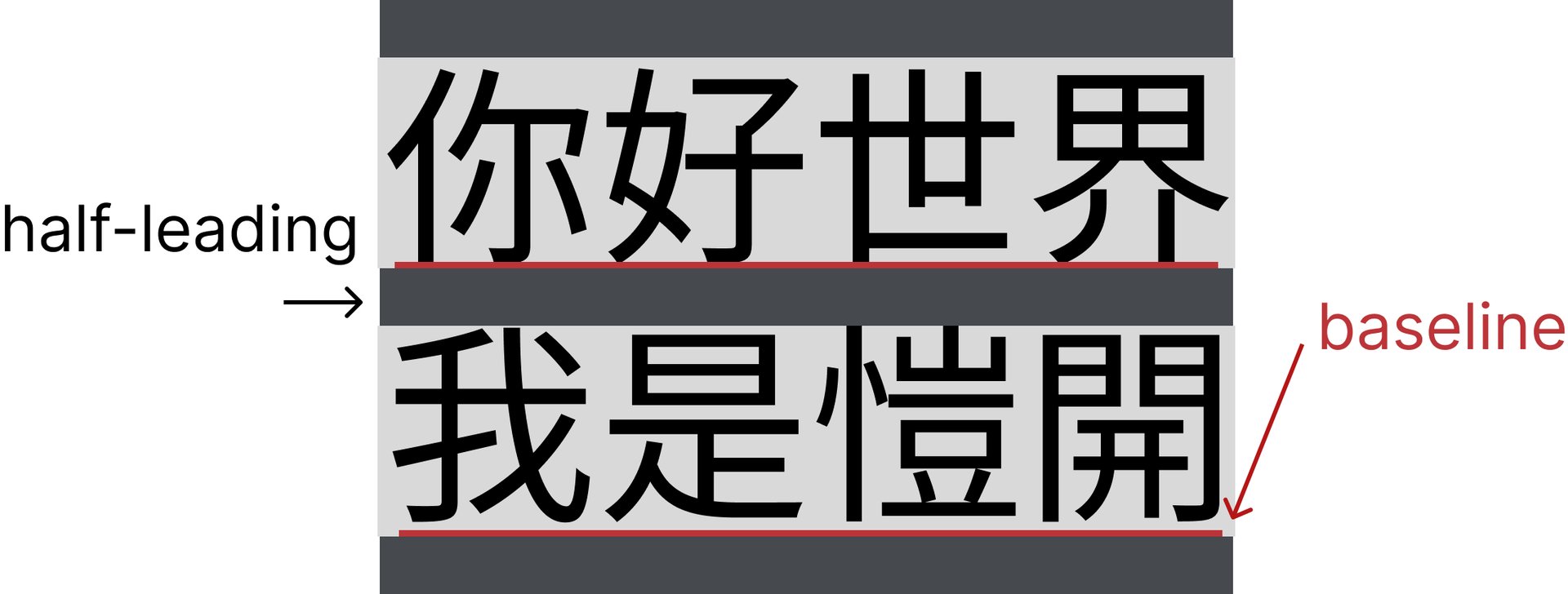
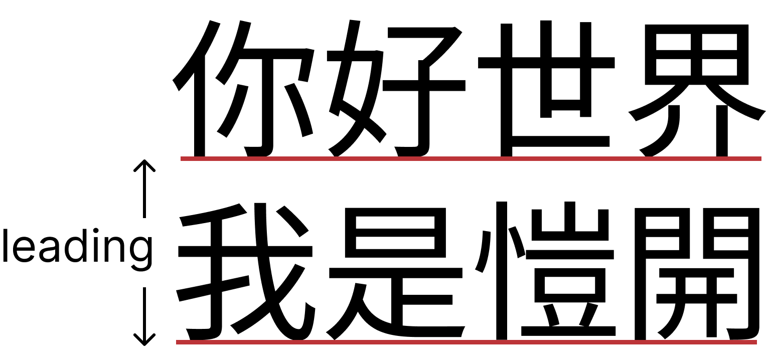
The gray boxes represent the line-height, which includes the half-leading. The W3C’s definition of half-leading can easily be confused with traditional print typography. In print typography, “leading” typically refers to the distance from one baseline (the red line below) to the next line’s baseline.
Why is setting it to 1 not recommended?
While setting line-height to 1 is convenient, I believe it relies on the flawed assumption that “the text will only ever be a single line.”
In reality, that isn’t always the case. Some users have smaller screens where text might not fit; others might increase their font size for accessibility; and some text comes from dynamic user input. In all these scenarios, text originally assumed to stay on one line can easily wrap. If you’ve set the line-height to 1, the wrapped lines will cram together, making the text very difficult to read.
Another scenario is localization and translation. Translated text often ends up significantly longer than the original. If a fixed height is hardcoded during implementation, the layout can break entirely when two lines of text overflow the container.
Setting text-overflow to ellipsis
You might think: if we need to guarantee a single line, why not just use text-overflow: ellipsis to truncate overflowing text with …? Depending on the context, this can work, but I recently realized that it comes with distinct challenges across different languages.
For instance, Japanese is an agglutinative language where grammatical meaning hinges on sentence endings. As a result, the most critical information often appears at the very end of a sentence. Adding an ellipsis makes it exceedingly easy to cut off the most important part:
- 私はイケメンです (I am handsome)
- 私はイケメンではありません (I am not handsome)
If the text happens to be truncated at で, it becomes:
- 私はイケメンで…
Is he handsome or not? Please let me know
Solutions
The simplest solution is to avoid assuming text will only ever span a single line. When designing UIs, allow as much room for text expansion as possible. Another approach is to let the line-height drive the element’s height, allowing the container’s height to be determined by the text’s line-height rather than hardcoding a fixed height.
“The whole reason we set line-height to 1 is because heights don’t align or the layout breaks!”
Indeed. It sounds simple in theory, but the core issue is that half-leading gets added to the top and bottom of the container. In most cases, we only want to keep the half-leading between lines of text.
We can use CSS to cancel out the height differences caused by half-leading. CSS provides a very handy unit: 1lh. Although it is a relatively new unit, it is already supported across modern browsers.
By using pseudo-elements with negative margins, we can cancel out the extra space. As for the calculation, we can use (1em - 1lh) / 2 to determine the value of the half-leading.
.btn {
	...
  line-height: 2;

  &::before {
    display: block;
    content: "";
    width: 0;
    height: 0;
    margin-top: calc((1em - 1lh) / 2);
  }

  &::after {
    display: block;
    content: "";
    width: 0;
    height: 0;
    margin-bottom: calc((1em - 1lh) / 2);
  }
}
The result looks like this: even with a line-height of 2, we successfully eliminate the top and bottom half-leading!
Another upcoming approach is the text-box-trim property, which is still in draft status and currently only supported in Safari Technology Preview. Its purpose is precisely to trim the top and bottom half-leading. An illustration on GitHub vividly demonstrates how it works:

With this, you will no longer have to worry about vertical alignment issues caused by line-height! While it will take time for all browser vendors to implement it—and drafts can sometimes stall indefinitely—it is definitely something to look forward to.
Conclusion
Although this post reevaluates the use of line-height: 1 and text-overflow: ellipsis, both techniques are still practical and sufficient in many common scenarios. This article aims to offer an alternative perspective and hopefully provide readers with some fresh ideas.
Related Posts
- Recreating My Room with Three.js Using React Three Fiber, I brought my real room into the browser—turning physical objects into an interactive table of contents, and using spatial memory to tell the story of my life and work over the past few years.
- Things to Keep in Mind When Using Images in Frontend Development Expanding on Jake Archibald's article, this post organizes how modern responsive images should be written: why width/height are still necessary, when to use CSS aspect-ratio, how to choose between AVIF and WebP, and using picture/source/srcset for art direction on mobile devices.
- CSS field-sizing — Auto-resize Form Elements with a Single Line of CSS Previously, auto-resizing a textarea required listening to scrollHeight in JavaScript. With CSS field-sizing: content, a single line replaces it all, supporting textarea, input, and select. This article covers the pain points of older approaches and how to use field-sizing.
- Make Your Link Underlines Look Better: text-underline-offset By default, underlines sit very close to the text. Some designers dislike this look, and personally, I don't think it looks great either.