How to Design Just-Right Tables
Recognize one fact: tables are meant for reading, not for flashy visuals.
Recently, I’ve had frequent needs to use tables in admin dashboards. Designing a user-friendly table is a challenge—especially when there are many rows and columns, users can easily get distracted by superfluous elements. In fact, when it comes to presenting data, the table remains an exceptionally effective layout tool, and its built-in features make our layout work much easier.
Tables in HTML
In HTML, a table is composed of several elements:
thead: Defines the header contenttr: Defines a table rowth: Defines a header cell
tbody: Defines the table body contenttfoot: Defines the table footer content
Try Not to Stretch the Table to 100% Width
Let the content within the table determine its own width. If you force the table to take up full width, the excessive spacing between columns can make it hard for users to read across rows.
Column Visibility Controls
If there are too many columns of data (for example, more than 10), you can provide checkboxes or similar controls to let users choose which columns they want to display.
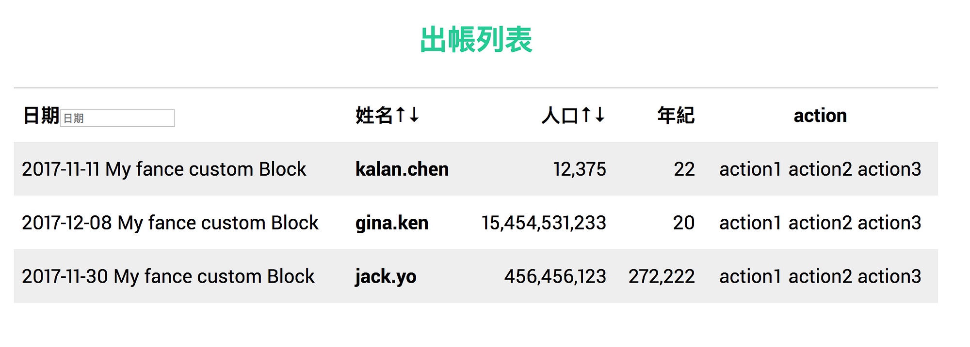
Add <caption>
You can add a <caption> inside a table to clearly label the table’s title. For example:
<table>
  <caption>
    <h4>出帳列表</h4>
  </caption>
  <thead>
    <tr>
      <th>日期</th>
      <th>姓名</th>
      <th>人口</th>
      <th>年紀</th>
    </tr>
  </thead>
  <tbody>
    <tr>
      <td>2017-11-11</td>
      <td>kalan.chen</td>
      <td>12375</td>
      <td>22</td>
    </tr>
  </tbody>
</table>
You can position it using caption-side: top | bottom.
caption {
  caption-side: top;
}
Remove Unnecessary Colors and Borders
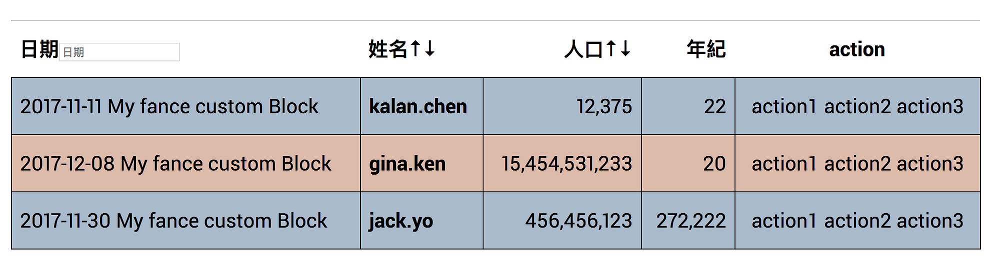
Although it might look vibrant at first glance, heavy borders and background colors create visual noise for users. What seems like a thoughtful design can actually make it harder to locate desired data.
Use simple grayscale for differentiation and eliminate (or lighten) border colors to reduce unnecessary visual clutter, making it easier for users to scan and find data.
Align Headers with Content
Generally, text should be left-aligned and numbers should be right-aligned. When numeric values change dynamically, you can add font-variant-numeric: tabular-nums (if supported by the font) to prevent layout shifts caused by varying digit widths.
Provide Simple Sorting and Searching
In dashboard systems, users often need to search through tabular data frequently. One approach is making an AJAX request to fetch updated data each time; another is handling it on the client side. We can offer a simple sorting feature to help users quickly find what they need, or provide a basic search filter.
Side note: Sorting can actually be done directly using element.appendChild. If the appended node is already a child of the parent element, it will simply be repositioned rather than creating a new node.
Additionally, to help screen readers understand the current sort state, you can add aria-sort:
<th aria-sort="ascending">
</th>
Consider a Simple @print Style
For billing systems, transaction logs, and records, operations staff might need to print out the table in addition to viewing it on the screen. In such cases, you can use @media print to handle print-specific details—such as defining font sizes in pt, converting colors to black and white, and reducing margins and padding. These are all essential details to keep in mind.
Responsive
Traditional tables typically handle mobile support by enabling horizontal scrolling. However, frequent horizontal scrolling on mobile devices is not an ideal user experience.
You can leverage data attributes along with CSS pseudo-elements to solve this. On mobile devices, we transform each row into a vertical block layout. Like this:
<table>
  <caption>
    付款紀錄
  </caption>
  <thead>
    <tr>
      <th>方案內容</th>
      <th>金額</th>
      <th>數量</th>
      <th>贊助日期</th>
      <th>贊助狀態</th>
    </tr>
  </thead>
  <tbody>
    <tr>
      <td data-label="方案">一枝草一點露,一人一百支持</td>
      <td data-label="金額">$100</td>
      <td data-label="數量">1</td>
      <td data-label="贊助日期">2016-12-26</td>
      <td data-label="贊助狀態">付款成功</td>
    </tr>
    <tr>
      <td data-label="方案">一枝草一點露,一人一百支持 TingChi</td>
      <td data-label="金額">$100</td>
      <td data-label="數量">1</td>
      <td data-label="贊助日期">2016-12-26</td>
      <td data-label="贊助狀態" data-status="fail">
        付款失敗
        <div class="repay-information">
          <button>重新付款</button>
          <button>刪除紀錄</button>
        </div>
      </td>
    </tr>
  </tbody>
</table>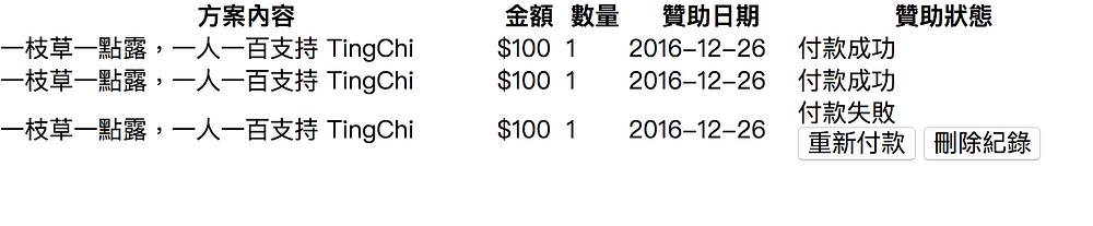
Transforms into:
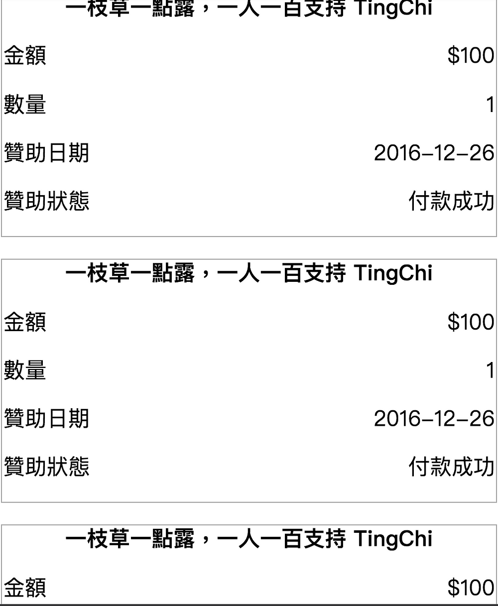
This way, users don’t need to scroll horizontally even on mobile screens.
{% raw %}
{% endraw %}table {
width: 100%;
font-family: "PingFang TC";
td {
text-align: cetner;
}
}
@media screen and (max-width: 500px) {
table > thead {
border: 0;
display: none;
position: absolute;
}
tbody tr {
border: 1px solid #aaa;
margin-bottom: 1em;
display: block;
}
td:first-child {
display: block;
font-weight: bold;
text-align: center;
}
td:not(:first-child) {
margin-top: 1em;
margin-bottom: 1em;
display: block;
text-align: right;
&:before {
float: left;
content: attr(data-label);
}
}
}Conclusion
Tables are incredibly convenient for presenting data—width calculations and equal-height rows are already handled out of the box. When building admin panels, tables are almost indispensable for viewing data.
There are also several nuances and best practices to keep in mind when designing tables. This article covered a few key points and simple implementations to consider when building tables. I’ll continue to add more tips in the future as they come up.
Related Posts
- Recreating My Room with Three.js Using React Three Fiber, I brought my real room into the browser—turning physical objects into an interactive table of contents, and using spatial memory to tell the story of my life and work over the past few years.
- Things to Keep in Mind When Using Images in Frontend Development Expanding on Jake Archibald's article, this post organizes how modern responsive images should be written: why width/height are still necessary, when to use CSS aspect-ratio, how to choose between AVIF and WebP, and using picture/source/srcset for art direction on mobile devices.
- CSS field-sizing — Auto-resize Form Elements with a Single Line of CSS Previously, auto-resizing a textarea required listening to scrollHeight in JavaScript. With CSS field-sizing: content, a single line replaces it all, supporting textarea, input, and select. This article covers the pain points of older approaches and how to use field-sizing.
- Make Your Link Underlines Look Better: text-underline-offset By default, underlines sit very close to the text. Some designers dislike this look, and personally, I don't think it looks great either.