Let’s Write Colors with CSS HSL! (And a Better Way)
# FrontendWhen writing colors in CSS, we usually define them with hex or RGB:
.gray {
  color: #fefefe;
}

.red {
  background-color: rgb(125, 125, 125);
}
This approach has been around for a long time, and it’s also the method I learned when I first started with web development. However, it does have a few problems.
Hexadecimal format is not easy for humans to read. For example, with #27cc95, just looking at those numbers, I have no idea what color it is. Hex is easy to parse, but for humans, representing color through the amount of three primary colors is not intuitive.
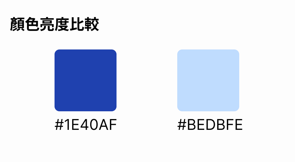
Another issue is that in design systems, colors in the same family are often arranged into a palette based on different levels of lightness, making it easier for designers to choose colors. However, even when only the lightness changes, HEX or RGB can look drastically different.
#BEDBFEand#1E40AF: the former is lighter than the latter, but it’s hard to tell from the HEX or RGB representation
After CSS and browsers evolved significantly, we can use a format that defines colors in a more understandable way — HSL.
What is HSL?
I’ve found that many web developers naturally start writing colors with hsl, and only after understanding it do they realize how intuitive HSL is for expressing color.
HSL expresses color in a way that is easier for humans to understand, and it consists of H (Hue), S (Saturation), and L (Lightness). If you’re into photography, you may have heard these terms often in image-editing software.
The color wheel looks like this:
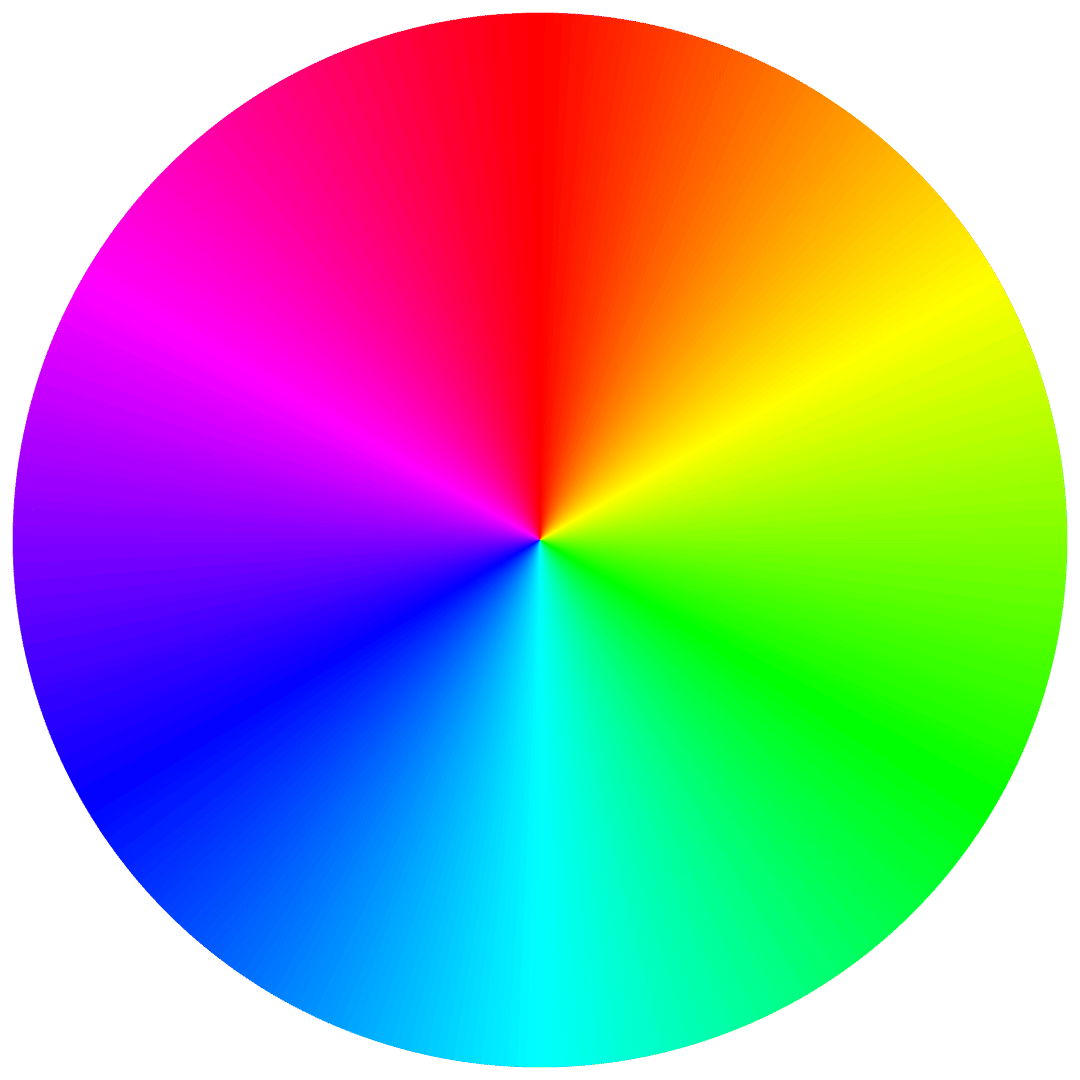
Starting from 0 degrees at the top, the colors are red, orange, yellow, green, blue, indigo, purple, and orange.
Saturation refers to how vivid a color is. The lower it is, the duller the color appears; if it’s too low, it starts to feel grayish. Higher saturation looks more vivid. Lightness is how bright the color is; the lower it is, the darker it becomes.
Once you understand this, you can look at color names that often appear in Tailwind or Material Design, which are based on lightness, such as color-indigo-100, color-indigo-200, and so on. However, in this naming system, the smaller the number, the lighter the color.
In practical use, besides lightness, there are usually other fine adjustments as well.
In CSS, HSL can be written like this:
.my-color {
  color: hsl(220deg, 30%, 20%);
}
Even before seeing the actual color, I can already know the following:
- At hue 220 degrees, it will probably be a bluish color
- It’s a fairly low-saturation, somewhat dark blue
The actual color looks like this:
Perceived brightness changes with hue
HSL is very intuitive to use, but some colors still appear brighter to the human eye even when their HSL lightness is the same. The clearest example is yellow.
hsl(236deg,100%,50%)
hsl(61deg,100%,50%)
Even though both have 50% lightness, yellow still looks brighter. This is because different colors have different wavelengths. For example, even at 60% lightness, it can look quite glaring on a screen.
這是一個標籤
這是一個標籤
If we add white text and use these as tag UI, the blue background still has acceptable contrast, but the yellow background contrast is awful.
In design systems, design elements with the same characteristics are often presented with the same lightness to create a unified and harmonious visual style. However, because of the limitation mentioned above, you can’t simply rely on using the same lightness for all combinations. Designers still need to spend extra effort fine-tuning the colors.
This is a major weakness of HSL, and we’ll talk about possible solutions later. Still, HSL remains a very effective tool for expressing color, and I hope everyone can learn it and apply it in their designs.
HSL as a design tool
What I’m about to say may be common knowledge for designers, but not necessarily for developers.
Adjusting text color on non-solid backgrounds
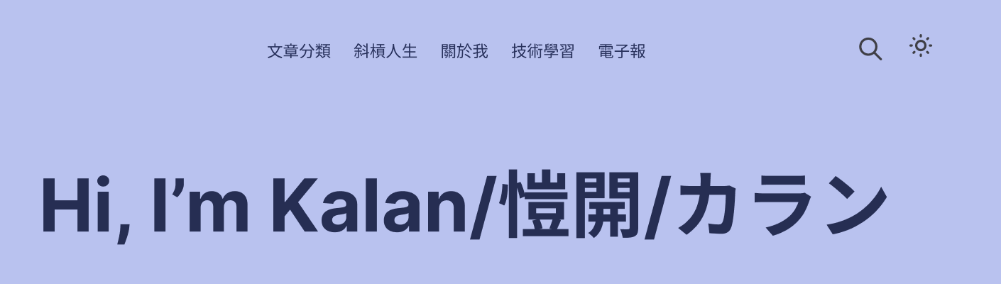
Presenting text on a non-solid background is difficult. You can make the overall result more harmonious by adjusting saturation and lightness. For example, on my blog homepage, I use hsl(230deg, 62%, 83%) as the background color, and the text color is hsl(230deg, 37%, 24%). By reducing both saturation and lightness, the result is not just black text with a slight tint of the background color, but a more cohesive-looking color overall.
Controlling brightness by adjusting hue
The operations mentioned above are easy to understand because we’re using HSL to represent them, so the role and contrast of each color becomes more intuitive. Once you get used to HSL, when designing UI, you’ll naturally start thinking:
- The background color of a tag doesn’t need to be too flashy; a light color with relatively low saturation will do
- The text color can be matched to the background by adjusting lightness and saturation
In this way, design is no longer just about feel — it becomes about intentionally adjusting things toward the effect you want.
HSL only supports the sRGB color space
sRGB is a color space standard supported by all displays. Although sRGB has existed for a long time and is very common, color spaces such as P3 introduced by Apple can display a wider color gamut on Apple screens (MacBook or Studio Display).
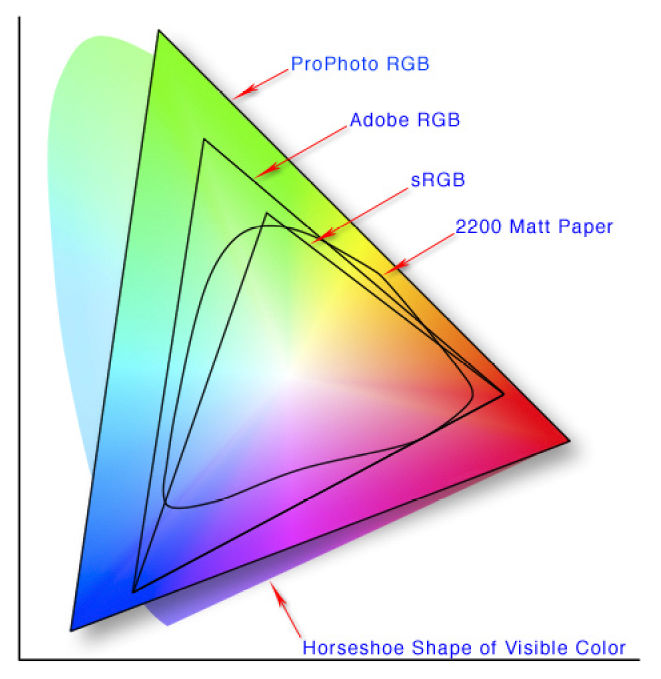
The difference between sRGB and P3
- sRGB: the most widely used color space, covering the color range of most displays and web applications. Its gamut is relatively small, making it suitable for general everyday use.
- P3: a wider color space, offering about 50% more colors than sRGB, especially in the green and red areas. It is commonly used on high-end displays (such as Apple’s Retina displays) and in professional image processing.
The next step for HSL – oklch
We mentioned that HSL has the problem of perceived brightness. Even when lightness is the same, the human eye is more sensitive to the brightness of some colors, which creates the issue that colors with the same HSL-defined lightness cannot simply be used interchangeably.
In addition, HSL gives every color the same saturation scale. This is because HSL simplifies the model by representing hue, saturation, and lightness as a completely flat plane. But whether on a display or in the human eye, the amount of saturation that can be expressed varies by hue.
To solve the perceived brightness problem, CSS 4 introduced a new color notation — oklch() — which also supports wider color spaces such as P3, and browsers even provide backward compatibility. When a color cannot be rendered in the current color space, it will automatically match the closest renderable color.
In the next article, we’ll talk about how to use OKLCH and what it looks like in practice!
Summary
In web development, traditional HEX and RGB color notations are widely used, but they are not very readable or intuitive, and their capabilities are limited in wider color spaces such as P3.
HSL (Hue, Saturation, Lightness) provides a more intuitive way to define colors, making it easier for developers to understand and adjust them. By describing colors through the three dimensions of hue, saturation, and lightness, HSL makes color adjustment more human-friendly. In design systems in particular, HSL can better represent lightness variations in a color palette.
However, HSL also has its limitations. For example, the perceived brightness differs across hues, causing colors with the same lightness to appear differently bright to the human eye.
To solve this problem, CSS 4 introduced the OKLCH color model. It not only reflects human perception of brightness more accurately, but also supports wider color spaces such as P3, and can automatically match the closest color, improving the color expressiveness of the web.
With HSL and OKLCH, developers can control web colors more precisely, improve design consistency and visual results, and prepare for future color standards!
Related Posts
- What to Pay Attention to When Using Images on the FrontendBased on an article by Jake Archibald, this post organizes how modern responsive images should be written: why `width`/`height` still matter, when to use CSS `aspect-ratio`, how to choose between AVIF and WebP, and how to use `picture`/`source`/`srcset` for switching images on mobile.
- CSS field-sizing — Auto-Resize Form Elements with One Line of CSSMaking a textarea auto-resize used to require JavaScript to watch scrollHeight. CSS field-sizing: content replaces all of that in one line, supporting textarea, input, and select.
- Make Your Hyperlink Underlines Look Better: text-underline-offsetBy default, underlines sit very close to the text, and some designers dislike this style. Personally, I don’t think it looks very good either.
- Why Web Design Shouldn’t Chase Pixel PerfectOnly pay attention to Pixel Perfect when it really matters; otherwise, it often leads to a lose-lose situation.